Don't just photograph the wall.
How do you turn workshop photos and Post-its into an output pack people can actually use?
The workshop shouldn't finish when everyone walks out of the room. And the output pack shouldn't be a collection of happy snaps, unreadable Post-its and photos of people standing beside flipcharts.
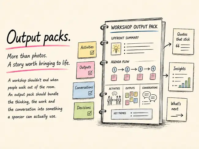
The thought
I've seen plenty of workshop output packs that are really just photo albums.
A title slide. A copy of the agenda. Photos of the activities. Photos of the walls. Maybe a few pictures of participants looking suitably collaborative. Then fifty slides of Post-its that nobody can actually read.
There is nothing particularly wrong with keeping those things. They are part of the record. But I think the output pack can do much more.
For me, it is an opportunity to pull the workshop back together after the room has emptied: a little bit of the activities, a little bit of what people produced, a little bit of what they actually said, and some of the thinking that shaped the design in the first place.
My preference is simple. Start with a short summary, then follow the workshop agenda. If activity one led to activity two, which changed the conversation going into activity three, the output pack should make that journey visible.
If it was a two-day workshop, I want to be able to see the two days. If there was an important conversation before lunch that influenced a decision after lunch, I want that thread to survive.
Why it helps
The most useful output packs combine a few different kinds of evidence.
There are the artefacts people made: Post-its, canvases, roadmaps, prioritisation exercises and drawings. There are the conversations around those artefacts. There are the facilitator's observations and notes. And sometimes there is a transcript from parts of the workshop that were recorded.
Those things become much more useful when they are brought together.
A photo of a prioritisation activity is useful context. The actual priorities written underneath it are more useful. A picture of a wall covered in Post-its shows the energy in the room. A short synthesis of the themes on that wall tells me what the room was thinking.
This is one place where AI has made the work noticeably easier. Modern OCR can often take handwritten or printed material visible in workshop photos and turn it into usable text.
That matters for readability. But there is another benefit that is becoming increasingly important.
In many organisations, internal AI tools will have a much easier time working with properly structured text in a PowerPoint or document than they will trying to interpret dozens of photographs buried inside it.
If I want to ask later what the recurring themes were, where tensions appeared, how this workshop compares with another one, or what decisions were made, machine-readable text gives me a much better starting point than a folder full of wall photographs.
When the handwriting wins
There is an obvious problem with all of this: workshop handwriting.
Sharpies, rushed Post-its, strange angles, half-finished sentences and handwriting that even the person who wrote it struggles to recognise an hour later.
OCR is improving, but it is not magic.
One of the simplest habits I value happens after everyone has left. Before pulling down the walls, walk the room. Activity by activity. Cluster by cluster. Post-it by Post-it.
And simply read the content aloud into your phone.
It sounds laborious. It really isn't. You can move through a wall surprisingly quickly. Now you have a transcript.
That transcript can sit beside the photographs, which means the visual record stays intact while the content becomes searchable, readable and much easier to synthesise.
You can keep important comments verbatim, group similar ideas, produce a cleaner summary, or hand the transcript and the images to AI together and ask it to help reconstruct the activity.
For a few extra minutes at the end of the day, you have rescued a lot of thinking that might otherwise disappear into an unreadable JPEG.
Structure before polish
I also think it helps to separate two jobs.
First: capture the story.
Get the photographs in. Get the activities in the right order. Add the transcript. Pull out the quotes. Add the decisions. Summarise the themes. Make sure the story is basically right.
Then: make it look good.
This is another area where tools like ChatGPT, Claude and Copilot have changed the effort involved. A rough PowerPoint can now become a reasonably polished one very quickly.
The starting point does not need to be beautiful. It needs to contain the right material and a sensible structure.
Then you can ask for help tightening the hierarchy, reducing clutter, improving consistency, making the slides more readable and turning something functional into something you would actually want to send to a sponsor.
That feels like a much better use of time than spending hours manually nudging text boxes around while the actual workshop content is still sitting untranslated on the wall.
Try it in the room
- Design the output pack before the workshop. Create the basic sections around the agenda so you already know where the outputs will go.
- Capture selectively. Take clear photographs of the outputs, not just photographs of people doing the activity.
- Keep the sequence. Label activities, walls and photographs so you can reconstruct the journey later.
- Record important plenary moments where appropriate. Quotes and short summaries bring the conversation back into the pack.
- Use OCR early. Turn readable workshop artefacts into text while the context is still fresh.
- Read the wall aloud when OCR struggles. Ten minutes with your phone can save an hour of guessing later.
- Keep both image and text. The photograph gives context; the transcription gives usability.
- Summarise for the sponsor. Put the main outcomes, tensions, decisions and next steps near the front.
- Let the agenda tell the story. The pack should broadly follow the journey participants actually experienced.
- Polish last. Get the content right first, then use AI to help with layout and presentation.
Photo → transcription → synthesis → story.
Watch for
The biggest risk is confusing more content with a better output pack.
Nobody wants a 140-slide forensic record of every Post-it produced during the day. The sponsor needs enough detail to trust the summary and enough structure to find the deeper material when they need it.
- Don't let AI invent the story. Use it to organise and synthesise what actually happened.
- Check OCR. Handwriting recognition can quietly turn one idea into another.
- Be careful with verbatim quotes. Make sure the wording is accurate and appropriate to attribute.
- Preserve disagreements. A neat summary can accidentally make a messy workshop look more aligned than it really was.
- Keep originals. Photos, transcripts and raw outputs are useful evidence even if they don't all belong in the final pack.
- Think about future use. If the pack might later feed internal search or AI, structured text and sensible headings become much more valuable.
- Don't over-design it. A beautiful pack that hides the thinking is still a bad output pack.
If a slide deck still feels too static, the same material can always become something more interactive — including the sort of simple click-through HTML format I've written about elsewhere.